
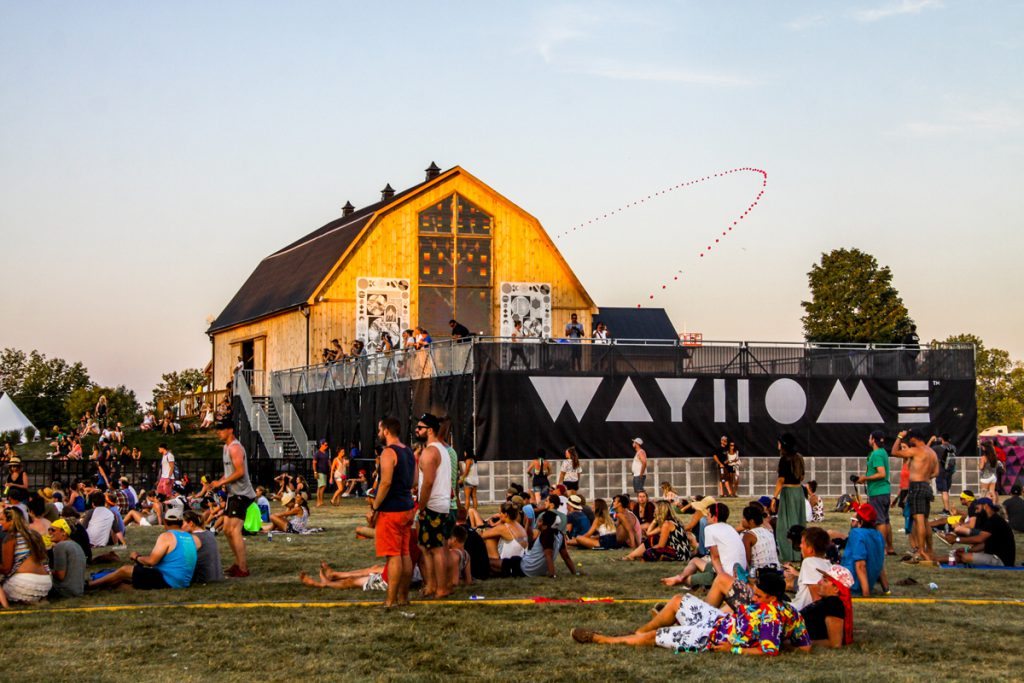
When WayHome Music + Arts festival rolled into Southern Ontario in summer 2015, it brought high-profile musical acts, flower crowns, and fringe vests along with it. The country went crazy for Canada’s Coachella; a cooler, closer alternative to the festival grounds we’ve been swaying in for years.
We expected the big stages with big performers, and we expected the field of elated fans frolicking towards the stage. But what we didn’t expect was a venue for showcasing and celebrating local design. As a non-profit that aims to make design accessible to new audiences, this gave us the warm fuzzies.
WayHome 2015 installation by Trevor Wheatley & Cosmo Dean
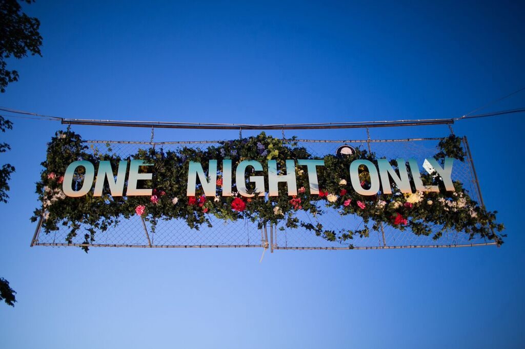
In 2015 the festival curated an exhibition space in the middle of the fairgrounds, creating a cultural experience for attendees. Installations set the stage for Instagram photos, giving exhibiting designers and artists more exposure than they could have expected (we’re talking 35,000 in-person views, and #WayMore social media views).
“A lot of major festivals hire big firms to create massive spectacles that are artistic in nature, but not something that is actually art,” said Spencer Cathcart, Creative Director of WayHome 2015 and Creative Director at Toronto studio Puncture Design. “We wanted to highlight local artists and give them the opportunity and platform to create something bigger than they’ve had the chance to do.”
Cathcart, who also happens to be the man behind WayHome’s branding, worked alongside Toronto painter Charles Bierk and WayHome festival director Ryan Howes to create the onsite arts experience, which included work from Toronto collective VSVSVS, multimedia artist Trevor Wheatley and cosmo dean, Bruno Bilio, Aaron Li Hill, Phillipe Blanchard and The PA System.
WayHome 2015 Shibori Sherpa installation by The PA System
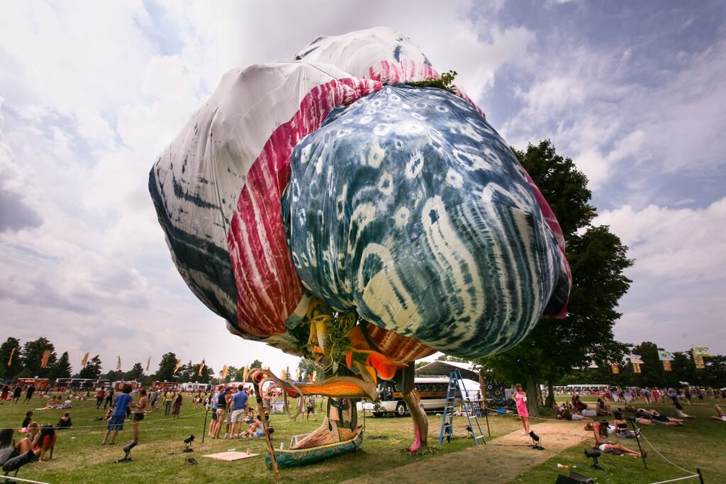
We would argue that WayHome Music + Arts is a little more Arts than Music. This is in large part due to the festival’s branding and design that offers some serious visual aesthetic.
WayHome’s branding is bizarre, beautiful, but above all eye-catching. Promo materials could easily be interpreted as a tribute to the late pop-culture legend David Bowie, or a visual commentary on the relationship between shapes and colours; a stark contrast from the light and airy festival designs we’re used to seeing. This is exactly what Cathcart had in mind when he dreamed up the look.
“With so many new festivals popping up these days, the only way to break through the noise is to reinvent the model,” said Cathcart. “The concept behind WayHome is simple, distinct and contemporary. Our logo and voyage into trippy digital media design reflects that.”
A collection of WayHome branding and design by Spencer Catchart and his team at Puncture Co. studio
While the concept of a music and arts-infused festival isn’t revolutionary, WayHome’s set-up is pretty unique. Unlike other festivals that treat art and design as a teaser to the main musical events, WayHome brings the two together to create one holistic sensory experience.
Like the musical lineup, the arts experience is built on a three-tier model of headliners, mid-level artists, and emerging artists, giving young designers the opportunity to be celebrated among seasoned professionals. To reach this audience, WayHome teams up with OCAD university to create a Faculty of Art competition, encouraging students to design and build an interactive installation onsite. The winning team receives a $5,000 prize, and $18,000 budget to bring their concept to reality. In 2016, over 30 teams of students submitted concepts and sketches to be considered, and one will be selected to be featured at this year’s festival.
WayHome is returning for a second set this July, and we can’t wait for another weekend of audio, visual and tactile experiences. If there’s anything we learned from last year, it’s to expect the unexpected. (Not including fringe vests and flower crowns. You can always expect those).

