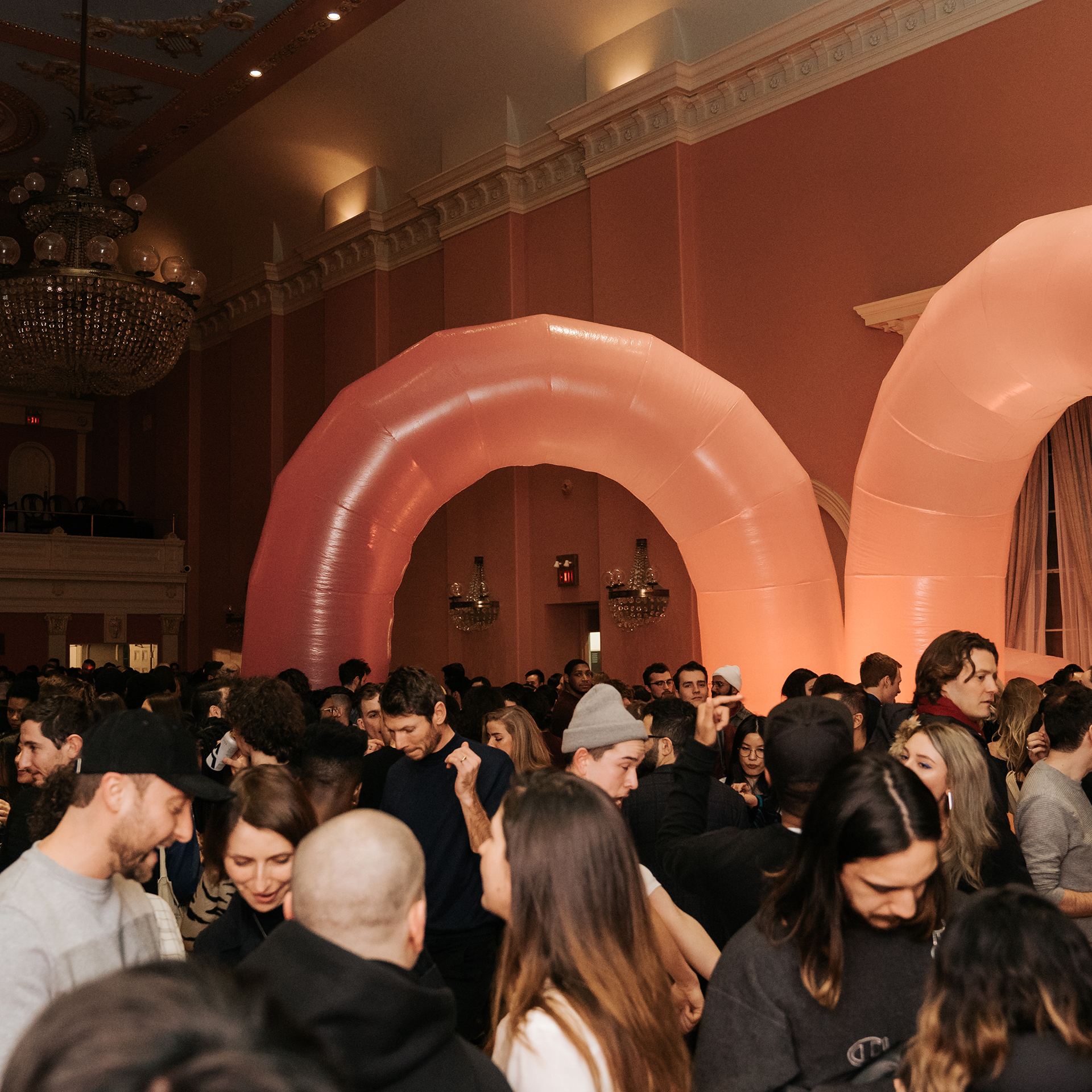
Designed by aftermodern.lab’s Hwa-jin Jun, DesignTO’s 2023 look and feel highlights personal connection and a return to gathering. For the first time since 2020, the 2023 DesignTO Festival will be a primarily in-person experience.
Hwa-jin took inspiration from this reconnection to physical space to design a look and feel that maintains DesignTO’s core identity while also offering freshness and excitement. Read on to learn more about what inspired this year’s design, Hwa-jin’s design process, challenges she faced and more.
How would you describe your graphic design style?
Process-driven and collage-like, with a focus on analog methodologies and digital filtrations. I enjoy using digital tools in unexpected ways and exploring unconventional methodologies. Fun is found in experimentation, and my personal practice thrives as a result.
Are there any specific artists, designers or movements that inspire your work?
Lately, creators like Alvin Luong and Dirk Koy have been very inspiring. I enjoy their invigorating visual perspectives and appreciate their use of form and movement.
Similar to Alvin and Dirk, I consider transformation of modest objects and environments into thoughtful compositions; I look to their artistic development over the years—from years ago until today—for the same growth I work hard to cultivate.
For those that don’t know, what do we mean by “look and feel”?
Look and feel refers to the visual direction and emotional response a design process elicits from viewers and participants. For DesignTO, this meant creating imagery that evoked a sense of community, space, interaction, and vibrant energy in viewers.
Where did you draw inspiration from for this year’s look and feel?
I did a lot of hiking and backpacking this summer, which imbued me with a renewed sense of energy. With this being the first time since 2020 that the DesignTO Festival would be primarily in-person, we realized that we had a responsibility to connect festival-goers with an experience centered around physical form. In this way, my experiences reconnecting with physical space heavily inspired the 2023 look and feel.
How would you describe the design process? Walk us through how you came up with the design.
The design process was driven by our goal of imbuing the Festival’s illustrations with feelings of journeyed paths and zeal. I like to word-map whenever I undertake new projects, and this year’s DesignTO concept was no different. As the scaffolding for the Festival’s visual identity came together, I kept coming back to words revolving around “spaces,” “journeys,” and “spiritedness.” It therefore felt natural to visualize the myriad of creative works DesignTO exhibits through simple forms that could be understood either as objects or walking paths.
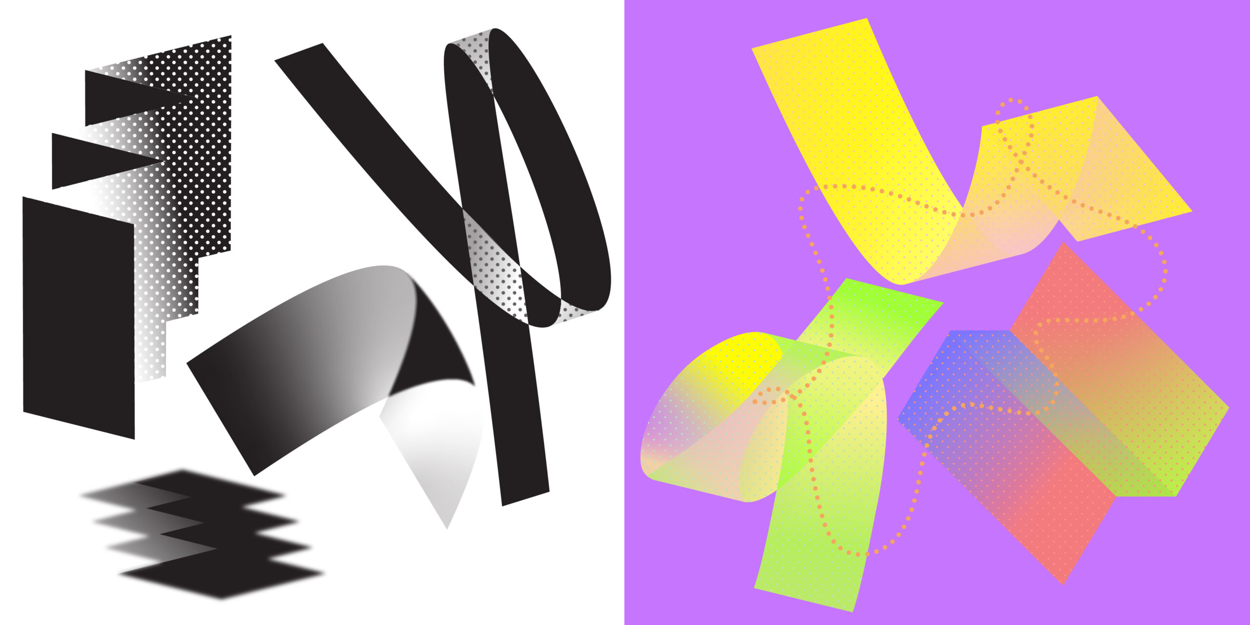
Lots of sketched paper was run through trying out different structures, and photographs of objects being used and sitting untouched were translated stylistically. The overall art direction provided was of modular construction. After connecting with Anthony Campea (principal, design and illustration at aftermodern.lab) and seeing his play on 2D geometric modular forms, it became clear that abstract geometry could take on whatever meaning the viewer feels they see. They had the greatest potential in aligning with DesignTO’s goal of recognizing diversity, so it was natural to push forward and further evolve this concept in my own way.
What did you know about DesignTO before taking on this project?
Last year as an intern at aftermodern.lab, I had the opportunity to work on the 2022 Festival. This experience provided an idea of the scope of work, variety of medium, and diversity of form. I was pleased to find out that events and exhibits take place across the city during the festival – not just in a single exhibition hall!
As a designer on this year’s project, I knew to keep the focus on the exhibits and educational programming that DesignTO brings to Toronto.
How did you maintain the core identity of the DesignTO brand while also making the look and feel distinct from past iterations?
Maintaining the core identity was a matter of understanding DesignTO’s intentions. Looking at past iterations and subsequently working on the creation of something which felt like a natural progression from where we were last year.
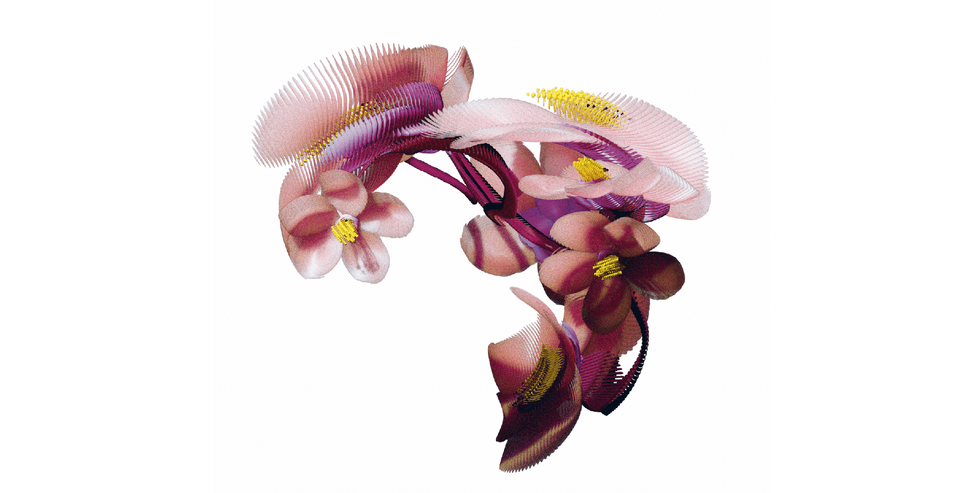
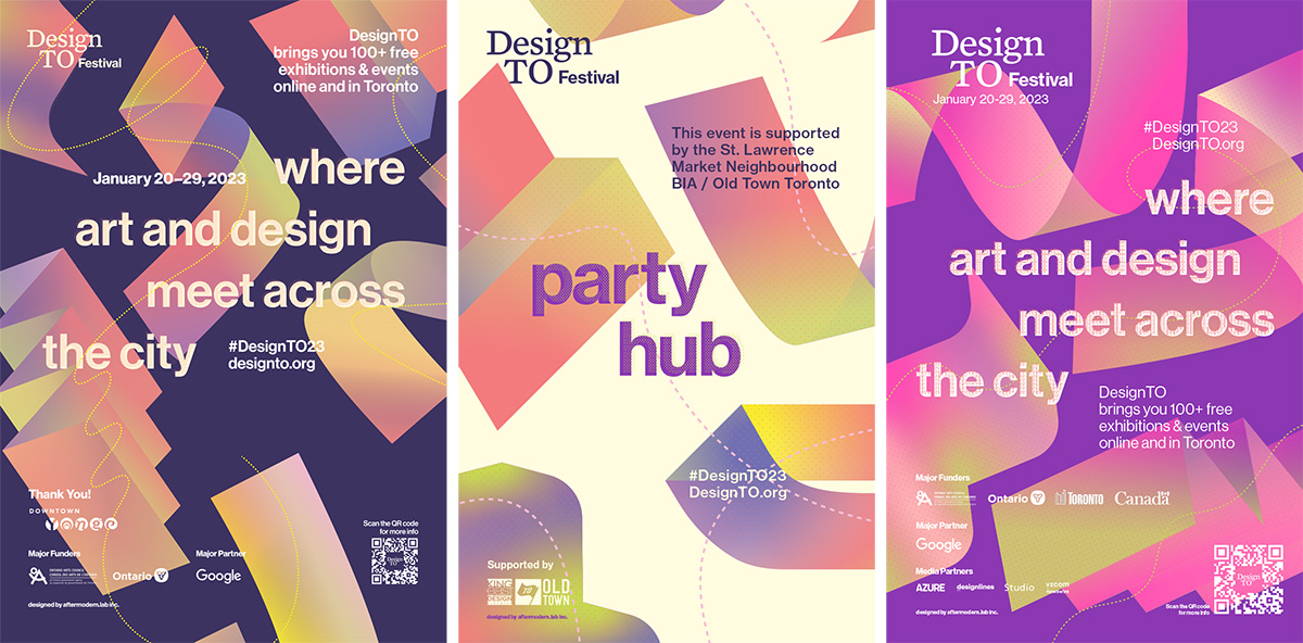
With prior concepts, stackable modular 2D forms and whimsical fills were engineered to construct familiar architecture or fun patterns. I wanted to continue with the concept of modularity but thought it would be fun to use colour to imply three-dimensional form. It was important that whatever I drew felt light and effervescent, so I created all of the forms from layers of gradient transparencies and textures.
Pairing this new visual language with a storied typographic language was also important to the success of the design, as was building on the studio’s reputation for typographic excellence juxtaposed with a diversity of form.
Were there any challenges you faced during the design process?
It can be difficult finding a direction to work on when there are so many potential paths to carve. I wanted to flesh out the vague concept of “transformation” and zero in on a successful visual interpretation. Learning to pinpoint and champion my design decisions was a big part of my design journey; I am very lucky to have an experienced mentor who guides me to believe in the work that I do and trusts in my making process and outcomes.
There were also considerations around the typographic language, as I looked to balance an established visual language with the whimsical direction of these illustrations. We ultimately resolved to maintain the use of the existing typeface, Neue Haas Grotesk, with some exaggerated letterforms to create a stronger relationship with the illustrated forms.
What are your favourite elements of the completed design?
I love the airy and bright feeling that comes through with the use of colour gradients. My intent is to have 3D forms emerge from colour, rather than be created by solid blocks of shadow and light. So much life comes through in the blending of layers and multi-coloured forms. The colour palette further imbues feelings of movement and liveliness.
My favourite detail is the partitive colour that is only visible upon further inspection. This dotted texture gives the composition a wonderful sense of depth and something new to discover particularly with large-scale graphics, such as the ones you might see on bus shelter ads in the next few months.
How do you hope people react to the new look and feel?
I hope viewers react with the renewed energy that inspired the visual language and explore DesignTO Festival—the first year mostly in-person since 2020—with vibrant eagerness to reconnect with physical form.
There is excitement brewing in many people to do the things they used to do pre-2020, and the aim is to tap into those feelings of happiness, community, and whimsy.
__
As you explore the Festival’s programming, keep a careful eye open for Hwa-jin’s designs as they brighten up most of our external-facing material, including the website, newsletter, social media, events and exhibitions signage. Thank you, Hwa-jin!
View the full Festival Schedule and plan your DesignTO Festival, January 20-29, 2023.